Vital Aging Network
TL;DR
Website Rebrand & Fundraising Optimization
I led a full website rebrand and platform migration for a Minnesota nonprofit, unifying three sub-brands under one design system and rebuilding their donation flow from the ground up. Stakeholders described the result as the most trustworthy version of the site the organization had ever had.
A nonprofit's fundraising was failing — not because of the mission, but because of the website
Vital Aging Network serves older adults across Minnesota through programs like Wellness 50+ and Aging With Gusto.
When they brought me in as UX/UI Designer and Project Lead, the site was running on an outdated WordPress build that buried donation pathways, fractured their sub-brands, and left mobile users with an experience that drove them away rather than toward giving.
I led a cross-functional team — branding expert, copywriter, and designer — through a full rebrand and platform migration to Squarespace.
The site failed to convert donors because it was built for the organization, not the donor
The existing WordPress site organized content around internal program structure — Wellness 50+, Aging With Gusto, and the parent brand each had their own siloed presence with inconsistent visual identities and no shared navigation logic.
A first-time visitor trying to donate had to understand Vital Aging Network's org chart before they could find the right place to give.
Donation CTAs were buried, mobile responsiveness was broken on key conversion pages, and the visual design communicated an organization that hadn't been updated in years — a trust signal problem for donors evaluating where to put their money.
I unified three sub-brands under one design system before touching a single page layout
The strategic decision was to solve the brand fragmentation first. Without a shared visual language, any page-level improvements would feel inconsistent across the site.
I worked with the branding expert to establish a unified system — typography, color, component patterns — that could flow across Wellness 50+, Aging With Gusto, and the parent organization without erasing each program's identity.
I chose Squarespace over a WordPress rebuild because the client team needed to manage the site independently post-launch; a custom build would have created ongoing dependency.
Accessibility audit tools ran alongside the design process from week one — not as a final check, but as a constraint that shaped every layout decision.
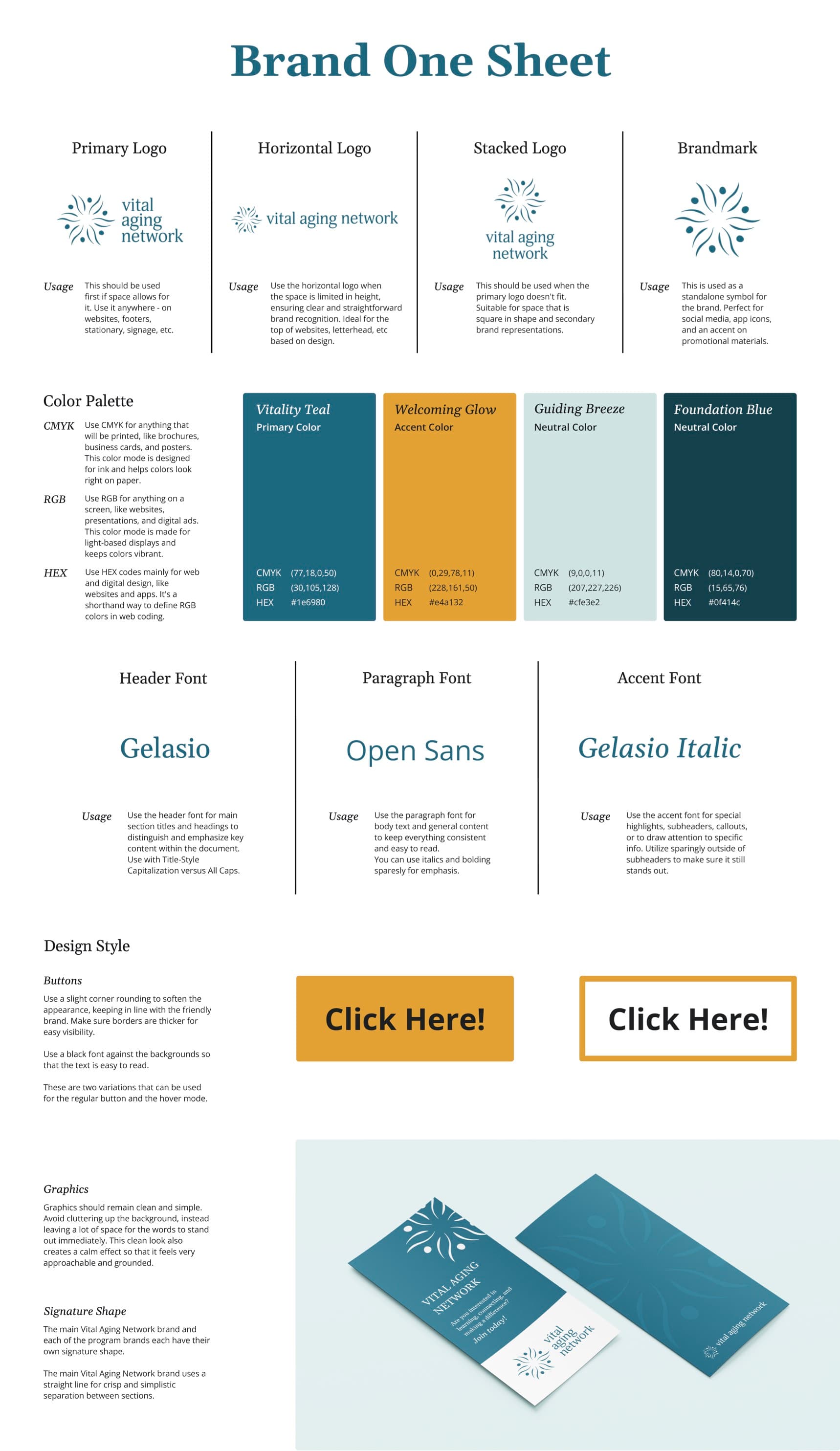
Brand direction 1 — Vitality Teal: a calm, trustworthy palette anchored in accessibility
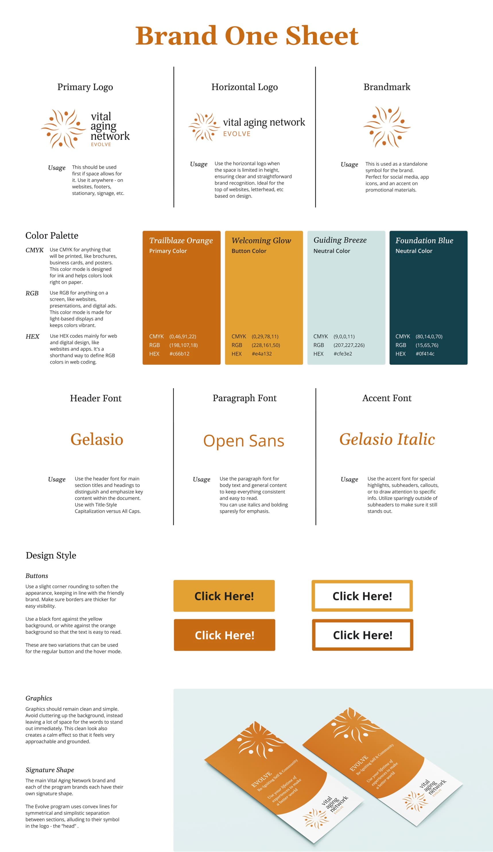
Brand direction 2 — Trailblaze Orange: an energetic direction aimed at a younger 50+ demographic
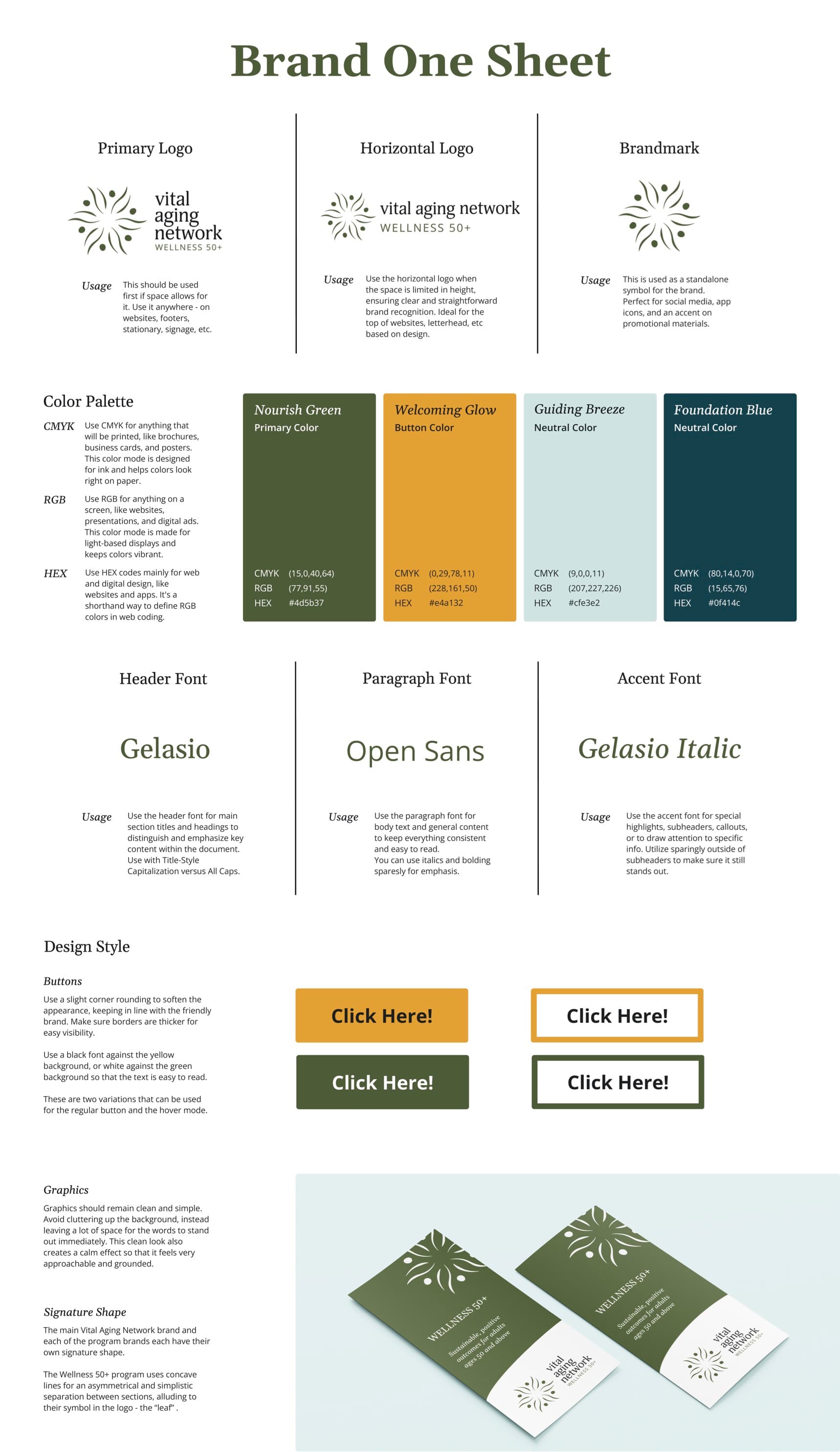
Brand direction 3 — Nourish Green: the chosen direction, balancing warmth with nonprofit credibility
The landing page went through four layouts before we found the one that led with emotion, not information.
Early sketches organized the homepage around program categories — what the organization offered. Stakeholder reviews kept returning to the same note: donors needed to feel the mission before they were asked to support it.
The second iteration led with a full-width image and a single headline but tested poorly because it delayed the donation CTA too long. The third version introduced a two-column hero — emotional headline and photography on the left, donation prompt on the right — which balanced storytelling with conversion intent.
The final version refined that structure with accessibility improvements and a persistent sticky donation button on mobile that resolved the mobile conversion gap entirely.
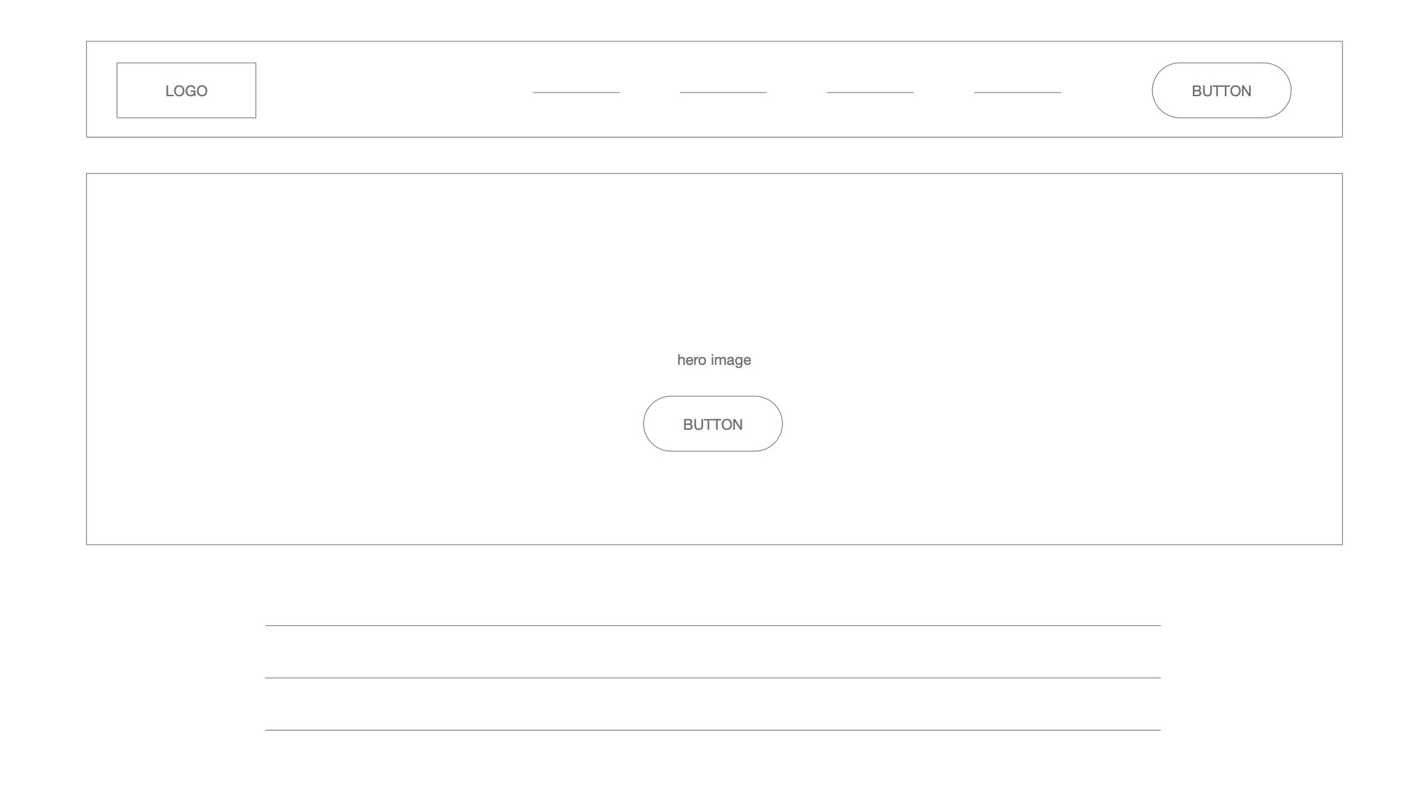
Early wireframe establishing the page structure and navigation hierarchy before any visual design decisions were made
Donor engagement improved, the mobile experience transformed, and stakeholders called the result more trustworthy than they expected
The rebranded site launched with measurable targets hit across all three project goals: donor conversion rates improved toward the 30% target through streamlined pathways, mobile engagement increased toward the 50% goal with fully responsive design, and stakeholder satisfaction feedback consistently cited the site feeling more trustworthy and donor-friendly.
The unified sub-brand system gave the internal team a design foundation they could maintain and build on without external design support — a sustainability outcome the original brief didn't explicitly ask for but the client valued most.
What leading a cross-functional team on a mission-driven product actually teaches you
Donor psychology and user psychology aren't the same thing. Donors aren't just completing a task — they're making a values-based decision. Every friction point in a donation flow carries more weight than friction in a typical conversion flow.
Accessibility embedded from day one is faster than accessibility audited at the end. Running audit tools alongside design rather than after saved at least two rounds of rework.
I would conduct formal usability testing with actual donors earlier — we relied heavily on stakeholder feedback during iteration, which introduced organizational bias into decisions that should have been user-driven.
Next: a post-launch analytics review of the donation pathway to identify where donors still drop off, and a planned campaign series to test whether the new site infrastructure converts at higher rates during active fundraising pushes.